Salvaged Patina Distress Ink | Collection of Specimens Card

Salvaged Patina, the latest Tim Holtz Distress Ink color, is now available and I must say it's definitely my favorite color so far. But then, I kind of say that everytime a new color is revealed! Do you feel the same way? I'm so excited that Tim and Ranger graciously sent the new color to me and of course, as soon as it arrived, I ran to my craft room to start playing. I began by inking some swatches and creating some backgrounds. During the process of playing, I ended up creating this Collection of Specimens card that uses the Salvaged Patina Distress Paint and Distress Glaze. These are two of the mediums that I use a little less often than the inks, and I really enjoyed playing with them!

Collection of Specimens Card by Juliana Michaels featuring Tim Holtz Salvaged Patina Distress Ink, Specimen Stamp Set and Mechanical Bigz Dies.

To get started, I took a piece of gold metallic Kraft Stock and embossed it using the Foundry 3D Embossing Folder. I then applied Salvaged Patina Distress Paint to it using my finger so I could get it into all the depressions. To get the distressed look, I wiped off some of the paint using a paper towel. With this technique, you want to allow the paint to just start to dry before you begin wiping off the paint so that some of it sticks to the paper. After wiping off the paint and getting the look I was going for, I allowed the paint to dry. 

Once the paint was completely dry, I used Mermaid Lagoon Archival Ink to stamp images from the Field Notes and Specimen. I used Archival Ink for the stamping because I was stamping over a painted surface and Distress Ink would never have dried on the nonporous surface.

Next, I worked on the gears. These are cut from chipboard using the Mechanical Bigz Die. I first applied Distress Grit Paste here and there to the gears and set them to the side to dry. Once the grip paste was dry, I painted them with Antiqued Bronze Distress Paint and allowed that to dry. Next came the magic! Using my finger to lightly apply Salvaged Patina Distress Paint to the raised areas created by the Grit Paste. If you apply too much of the Salvaged Patina, just let it completely dry and then add a little more Antiqued Bronze over it. The main thing to remember when working with paint is allowing it to completely dry between colors. If you don't, you are much more likely to end up with mud! The Machinery Heads were painted with Distress Collage Medium and once it was dry, I added Mushroom Alcohol Ink.

Now onto the fabulous beetle. He is from the Specimen Stamp Set and stamped onto Distress Heavystock using Black Soot Archival Ink twice. Using a Distress Embossing Pen I applied embossing ink to the body of the bug on one of the images, sprinkled Salvaged Patina Distress Glaze over the area and heat embossed it. I repeated this process 3 times to build up a thick layer of the glaze and mimic the look of exoskeleton. I then fussy cut the entire image and then just the body to create two layers that I adhered together using double sided foam adhesive.

To finish off the design, I added some leaves from the Skeleton Leaves Thinlits which were die cut from Distress Watercolor Paper and smooshed into a bit of Old Paper Distress Ink. I also added stamped images from the Field Notes Stamp Set which I stamped in Vintage Photo Archival Ink. These were also smooshed into Old Paper Distress Ink and after trimming them to size, I inked the edges with Vintage Photo Distress Ink.

The final step was to layer the main panel onto a piece of watercolor paper that was smooshed into Old Paper Distress Ink and then onto a piece of metallic Kraft Stock. The finished size of this card is 5x7 inches.

Thanks for stopping by today and checking out my Collection of Specimen Card created using the brand new Tim Holtz Distress Ink Color Salvaged Patina!

Supplies
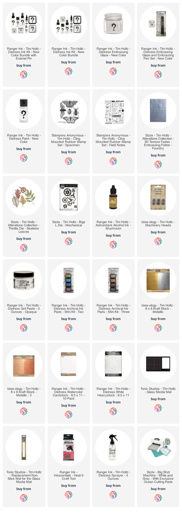
Below you can find the products I used to create this project along with compensated affiliate links to Scrapbook.com. These links are at absolutely no extra cost to you. If you want to learn more about what an affiliate link is, you can see my full affiliate and product disclosure statement here

Bloom Where You Are Planted Card | Tim Holtz Brushstroke Flowers No. 3

Hello friends! I'm back today with the third and final project I created for the Tim Holtz Sizzix Chapter 2 Release. If you're looking for even more inspiration make sure you check out Tim's blog post where he has linked to all of the makers and the projects they've created. Many of them have created wonderful blog posts that share how they created their project.

This Bloom Where You Are Planted Card features the beautiful Brushstroke Flowers No. 3 Thinlits. There are now three gorgeous floral dies that have this same style and they are perfect for mixing and matching to create a custom bouquet.

Bloom Where You Are Planted Card by Juliana Michaels featuring Tim Holtz Sizzix Brushstroke No. 3 Thinlits

For this card, I die cut the flowers from Distress Kraft Stock in a mix of colors. Because these dies are all one piece, I die cut each flower from two shades of the same color and then layered them to create the finished design. To give each flower another bit of interest, I added an additional layer of the bottom layer and offset them.


Once the flowers where die cut, I used the Tim Holtz Shaping Kit to give the layers even more dimension and interest. For some great tips and tricks on working with the Shaping Kit, I highly recommend checking out Tim's Shaping Kit Demo.

After I completed the shaping, I inked the edges with a bit of Vintage Photo Distress Ink and adhered the layers using double sided foam adhesive for even more dimension.


Once I was finished with the flowers, I added some die cut leaves and used the Shaping Tools on them as well.


For the background I embossed a piece of Distress White Heavystock using the 3D Texture Fades Typewriter Embossing Folder. I then ink smooshed the paper into some Old Paper Distress Ink that I had smooshed onto my craft mat and spritzed with water. I used a heat tool to dry the ink.


To finish off the background I added some machine stitching around the outside edge. I then adhered the Brushstroke Flowers using double sided foam adhesive. The final step was to add a sentiment which I typed out using my vintage typewriter. I trimmed it size, inked the edges and attached it double sided foam adhesive.


I absolutely love the dimension and shape the Shaping Kit adds to die cuts such as these Brushstroke Flowers No. 3. Have you tried out this new tool? What did you think? I'd love to hear how you used it!

Supplies

Below you can find the products I used to create this project along with compensated affiliate links to Scrapbook.com. These links are at absolutely no extra cost to you. If you want to learn more about what an affiliate link is, you can see my full affiliate and product disclosure statement here

How Scrapbook.com Simple Scrapbooks Inspired Me To Start Scrapbooking Again

Those of you that are new here may or may not know that I actually first developed the paper crafting bug when I was introduced to scrapbooking way back in 1997. I continued scrapbooking for many years, but in 2016 I really started to lose my love of it so I just stopped and switched over to making cards and coloring. It was a great change and one I really loved. Then in 2019 I slowly began playing around more with mixed media and I then fell in love with all things Tim Holtz!

I realize, many of you here know the Tim Holtz side of me, so I hope you can appreciate my need to mix things up here and there and that I really just love to share what I enjoy creating. Don't worry, I'm definitely still in love with all things Tim Holtz, and most of what you see here will continue to be of that style, but I wanted to share how Scrapbook.com Simple Scrapbooks inspired me to start scrapbooking again.

How Scrapbook.com Simple Scrapbooks Inspired Me To Start Scrapbooking Again Juliana Michaels

Last year, as was the case for many of us, was a time of reflection, introspection, change and growth. I also began to get the itch for scrapbooking again but I knew I needed it be different than the last time. I was no longer interested in large 12x12 layouts with lots of patterned paper and embellishments. I wanted something simple and pocket pages seemed the way to go. I had never really done them before, so working with pockets was a bit of a learning curve for me in how to organize and lay out out my pages. However, with the help of the Scrapbook.com Simple Scrapbook Pocket Cards I have found a groove and fallen in love with the format. I decided to stick with a much smaller size and I'm currently working in the 6x8 albums. It's just enough room for me to include a few photos, but most importantly room for my journaling and the story behind the photos. This was never my strong suit, as I really just liked playing with the paper and embellishments, but this time around I needed the focus to be different.

On the pages I'm sharing today I used the Scrapbook.com Simple Scrapbooks Adventure Calls Cards and I combined it with various embellishments from Pinkfresh Studio Some Days collection.


Once I realized I was going to stick with the pocket scrapbook style, I purchased a Canon Selphy. I love the flexibility it gives me for printing on demand, but I don't care for the fact that the pictures aren't truly 4x6 or that you can't fit two 3x4 photos on one piece of photo paper. So I just focus on the convenience and deal with the size by matting the photos to get the size I want. Sometimes I add a piece of white cardstock, but other times I can just adhere them to the backside of the pocket card they are sharing a pocket with.


Along with the printing and pocket cards, I've slowly expanded my supplies to include some traditional scrapbook supplies such as stickers, die cuts and patterned paper. I especially love the 6x6 or 6x8 paper pads since they can be cut down to fit the pockets and allow me to create my own custom cards. With all the additional supplies I was slowly realizing I didn't have a great way to store all my new goodies.

Thankfully Scrapbook.com has created the Craft Room Basics Stadium Organizer and the Pocket Cards Organizer. These organizers make it really convenient to keep all my supplies together and I can easily bring these over to my craft table when I'm ready to work on my scrapbook pages.


They also have tabbed dividers that are sized to help further organize 4x6 and 3x4 pocket cards and they come in sets of white, warms and cools. These packs of dividers come with labels, however I'm still so new with this, that I'm not quite ready to divide them by theme or anything so for now I haven't labeled anything and I'm just using them to divide the different sets I currently have in my stash.


I hope you enjoyed this peak into how Scrapbooks.com Simple Scrapbooks inspired me to start scrapbooking again along with the current process and set up I'm using.

Supplies

Below you can find the products I used to create this project along with compensated affiliate links to Scrapbook.com. These links are at absolutely no extra cost to you. If you want to learn more about what an affiliate link is, you can see my full affiliate and product disclosure statement here.

With Brave Wings Framed Panel | Tim Holtz Countdown Thinlits

Hello friends! Today I'm sharing the second project I created for the Tim Holtz Sizzix Chapter 2 YouTube Live. This project is a framed panel that features the Countdown Thinlits as well as a personal favorite from the Chapter 1 Release - Perspective Butterfly. I combined them to create this With Brave Wings Framed Panel. 

Before we get on with the details, I just wanted to apologize for the small delay in getting this project posted. I had planned to have it posted earlier this week, however this past weekend I sustained a mild concussion and because of that, I'm currently limited with my online and crafting activities while I recover. I have been able to work on the written part of this project over the last several days, in small increments, so I could share this project with you today. As I think about this project, the message it shares is rather fitting for me at the moment. It's important to remain brave in the midst of life's struggles and if you aren't feeling brave don't be afraid to reach out to those around you so they can provide you with the support you need to fly.

With Brave Wings She Flies Framed Panel by Juliana Michaels featuring Tim Holtz Sizzix Countdown and Perspective Butterfly Thinlits

So first off, where did this idea come from? I'd love to share some great story about what inspired me, but the truth is I was just die cutting the Countdown Thinlits from some scrap paper and playing around with them when I came up with the idea of making a background that had texture created by layering die cuts. I'm not sure if I shared this or not, but when I get the new dies, the first thing I do is cut them out and play around with them. I do this to get a feel for the size and how they speak to me.


I began by cutting a piece of Distress Heavyweight to the size of the Idea-ology Framed Panel (approximately 6 3/8" x 8 7/8"). I then die cut the same paper using the Perspective Butterfly Thinlit and adhered it to the paper using Distress Collage Medium.


Next, I spritzed and sprayed the paper using a mix of Salty Ocean and Vintage Photo Distress Spray and Frayed Burlap and Mermaid Lagoon Distress Oxide Sprays. I dried them with my heat tool and then spritzed the paper with water using my Distress Sprayer and dried it again.


The next step was to start adding some layers. Using the Countdown Thinlits I die cut some random numbers from black cardstock and adhered them to the background using Distress Collage Medium.


For this next step, I unfortunately forgot to take photos so I'll do my best to explain what I did. During this step, I added some visual interest and texture by applying Translucent Grit Paste over the Digits Layering Stencil. Once this was dry, I placed the stencil back over the dried Grit Paste and dabbed embossing ink over the stencil. I then removed the stencil and sprinkled the design with Clear Embossing Glaze and heat embossed it using a heat gun. To add a bit more color and interest, I then rubbed Antique Bronze and Walnut Stain Distress Crayon here and there over the piece. When working with Distress Crayons, remember to work in small sections. Apply the crayon and then rub it in using your finger or a small rag. I find my finger to be the best blending tool though for this medium! The Distress Crayon seemed to really bring the textures and layers to life.


With this completed, I trimmed the paper to fit inside the frame, adhered the frame and then adhered the paper inside the frame. To add color to the frame, I simply dry brushed Black Soot Distress Paint over the frame. This technique allows some of the natural wood color to show through here and there and gives it a distressed look. Don't worry if you add too much paint though. You can use sandpaper to easily remove some of the paint.


With the background completed, I moved onto the phrase using the Alphanumeric Stretch Upper Thinlits. To give them dimension, I adhered black cardstock to double sided foam adhesive and then die cut the letters. This added just the right amount of dimension.


I then finished off the piece by adding the Quote Chip which I inked with some Vintage Photo Distress Ink and some Hardware Heads distressed with Mushroom Alcohol Ink.


Thanks so much for stopping by today and checking out the details on how this With Brave Wings Framed Panel came together.

Supplies

Below you can find the products I used to create this project along with compensated affiliate links to Scrapbook.com. These links are at absolutely no extra cost to you. If you want to learn more about what an affiliate link is, you can see my full affiliate and product disclosure statement here.

Bee You Cards | Tim Holtz Funky Insects

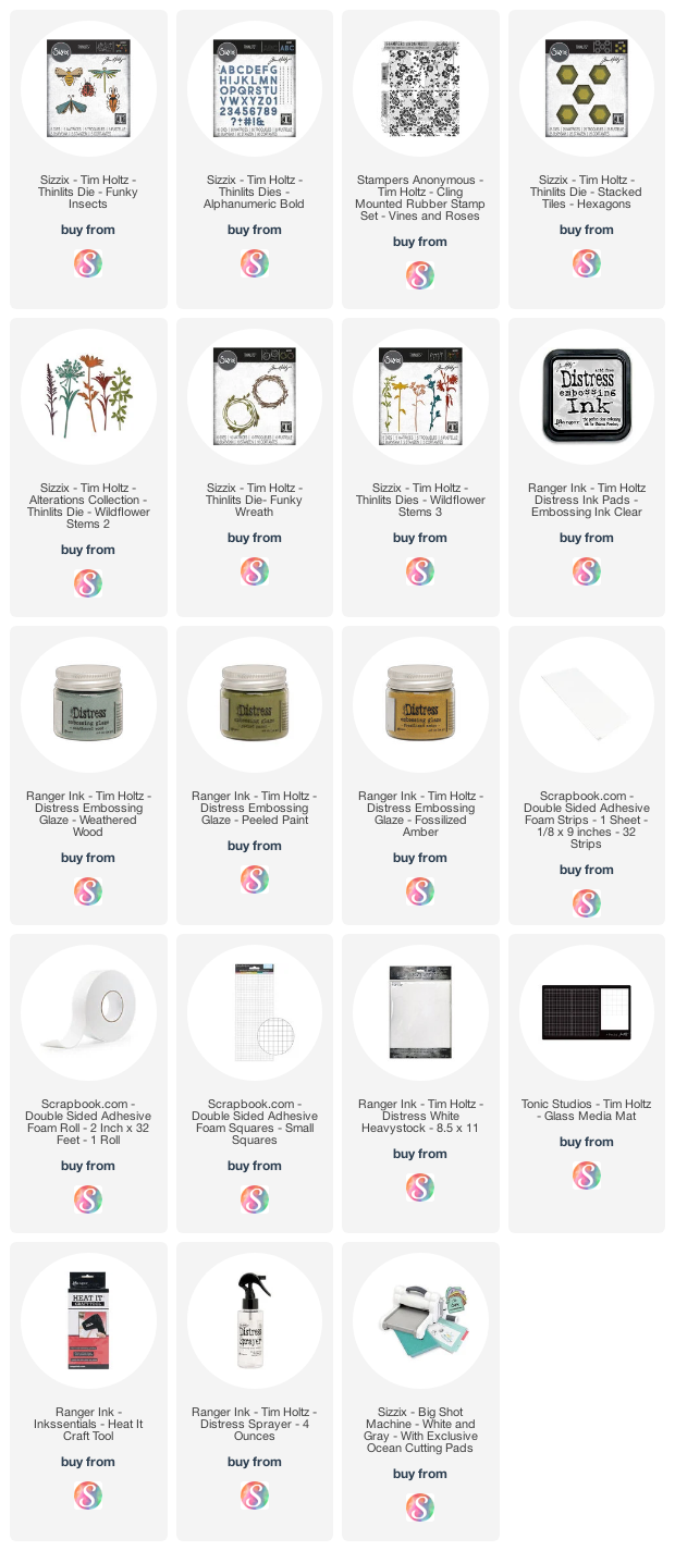
Hello friends! I'm so excited to share my first projects with you today featuring some of the Tim Holtz Sizzix Chapter 2 Dies. Tim shared all about them today on his YouTube Live and so I wanted to share with you how this set of cards came together using the Tim Holtz Funky Insects Thinlits.

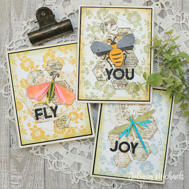
Bee You Cards by Juliana Michaels featuring Tim Holtz Funky Insects Thinlits

I began by creating the insects. Anytime I play with a new die set, I almost always start by playing around and figuring out what papers and colors I want to work with for the final project. I ended up making these bugs about 3 times before finally settling on what ended up on these cards. Originally I had only planned on making one card, however when I finished the first card, I decided it would be fun to create a set of cards using all the bugs I had created!

Bee You Card by Juliana Michaels featuring Tim Holtz Funky Insects Thinlits

[Bee You Card Details: Background - Peeled Paint Distress Embossing Glaze, Fossilized Amber Distress Ink, Funky Insect - Black Soot and Fossilized Amber Distress Ink]

I die cut each of the Funky Insects from Distress White Heavystock and colored the various parts by ink blending them with Distress Ink. I then cut out the wing sections from a plastic envelope. I adhered all the layers together and used double sided foam adhesive to attach them to the card.


Now that the bugs are completed, let's talk about the background. For each card, I used the Vines and Roses Stamp Set. I stamped the image onto a piece of Distress White Heavystock with embossing ink, sprinkled it with Embossing Glaze and then heat set it using an embossing heat gun.

Fly Card by Juliana Michaels featuring Tim Holtz Funky Insects Thinlits

[Fly Card Details: Background - Fossilized Amber Distress Embossing Glaze, Peeled Paint Distress Ink, Funky Insect - Crackling Campfire, Kitsch Flamingo, Peeled Paint and Black Soot Distress Ink]

I wanted to add some layers of interest, so next I took a piece of Distress White Heavystock and did a bit of ink smooshing with Old Paper Distress Ink. I then added some stamping using the Entomology Stamp Set and Distress Inks in Black Soot, Frayed Burlap, and Pumice Stone. After applying the ink, I lightly spritzed the stamp with my Distress Sprayer and then stamped the image onto the paper. I then took the Stacked Tiles Hexagons and cut out a bunch of hexagons in three different sizes.


Once the die cutting was completed, I began arranging the hexagons onto the card background until I was pleased with the arrangement.

Joy Card by Juliana Michaels featuring Tim Holtz Funky Insects Thinlits

[Bee You Card Details: Background - Weathered  Distress Embossing Glaze, Fossilized Amber Distress Ink, Funky Insect - Peeled Paint and Salty Ocean Distress Ink]

I still felt like they needed a little more texture, so I die cut a piece of Distress White Heavystock using one of the following Thinlits: Wildflower Stems 1, Funky Wreaths and Wildflower Stems 3. I inked each of these with a bit of Vintage Photo Distress Ink before adhering them to the card. 


To finish off each card, I used the Alphanumeric Bold Thinlits to die cut a word for each card. To give the letters dimension, I adhered a piece of black cardstock to a piece of double sided foam adhesive before die cutting each letter. 


Thanks for stopping by today and I hope you enjoyed learning the process behind how I created these cards featuring the Tim Holtz Funky Insects Thinlits.

Supplies

Below you can find the products I used to create this project along with compensated affiliate links to Scrapbook.com. These links are at absolutely no extra cost to you. If you want to learn more about what an affiliate link is, you can see my full affiliate and product disclosure statement here.
Subscribe