Flower Shop | Diffused Ink Blending Technique

Hello friends! Daily life as we know it has definitely changed for many of us as we navigate this Coronavirus and Covid 19 Pandemic. From changes to our daily routines and activities to more drastic changes such job loss or even the loss of a loved one, it is impacting so many of us.  It has hit me in a way I never expected, but I'm taking it one day at a time and trying to look at all the wonderful things I still have to be grateful for in my life. One of them is doing what I love and that is creating and making.

DIFFUSED INK BLENDING TECHNIQUE

Today, I'm sharing a card I created for Tim Holtz using some of his stamps from Stampers Anonymous. This card features the Diffused Ink Blending Technique. I came across this technique through a video by Laura Jane that you can view here. I've applied this technique to the Flower Shop Stamp Set and used it to create a background for my card.


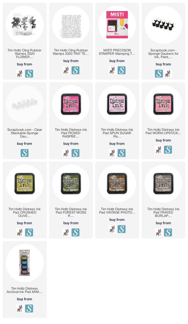
For the Diffused Ink Blending Technique you will need a stamping platform, a selection of Distress Inks and at least one finger tip sponge dauber for each color family.  I recommend using these kind of blenders for this project because they are smaller and will allow you to apply the ink to smaller areas on the stamp. For this rose image from the Flower Shop Stamp Set I used Spun Sugar, Worn Lipstick, Picked Raspberry for the flowers with a bit of Squeezed Lemonade. For the leaves I used Crushed Olive and Forest Moss.

I began by applying the darkest shade of ink using the sponge dauber to the areas on the stamp that are the shadow. I then stamped the image. If the ink needed to be darker, I repeated the ink application and restamped. I then added the next lighter color to the middle areas and finally the lightest color to the highlighted areas. The main thing to keep in mind is that each time you add color you're not covering the entire stamp or image area. You're only putting the ink in the area you want that color. For a bit of a pop on the edges of the flowers I added some Squeezed Lemonade. For the leaf areas I did the same thing and applied the darkest color to the shadows and the lightest color to the highlights.


I moved the stamp around on paper and repeated the Diffused Ink Blending Technique until I had covered the paper.  For added interest, I used the same technique with a text stamp. On this I used Vintage Photo and Frayed Burlap Distress Ink.


To finish the card, I added some ink splatters. For the ink splatters I stamped the ink pads onto my glass mat, spritzed them with water, picked up the ink with a paint brush and then flicked it onto the paper. I then inked the edges of the card front with Spun Sugar. I then layered the entire piece onto a piece of cardstock inked with Crushed Olive Distress Ink. I just love how you can create perfect coordinating papers with a little ink blending! I then finished off the card with a sentiment from the Tiny Text Stamp Set using Peeled Paint Archival Ink.

Thanks so much for stopping by today. I hope you enjoyed learning about the Diffused Ink Blending Technique. What stamp set would you use this technique with?

SUPPLIES

This post contains affiliate links to Scrapbook.com and Simon Says Stamp. If you buy anything through my links, it adds no extra cost to you. I truly appreciate and thank you for your support! (If you're interested, you can see my full disclosure statement here.)


Baroque | Alcohol Ink Lift Techniques

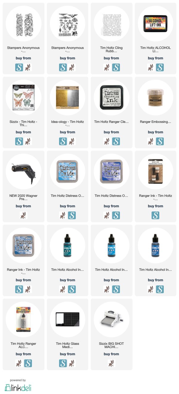
Hello friends! Today, I'm sharing two cards I created using the Tim Holtz Baroque Stamp Set and there were on display in the Stamper's Anonymous Booth at Creativation. Both of these cards are the result of a happy accident involving Alcohol Ink. Don't you just love when that happens?

So this happy accident business all started with me trying to use the Alcohol Lift Ink. I was playing with Alcohol Inks and had created this beautiful blue background and I thought it would be fun to use the Alcohol Lift Ink with the beautiful flourish from the Baroque Stamp Set and create a dramatic lifted stamp image. Well, when I tried this, the fine detail of the design didn't give me anything even remotely dramatic. In fact, I could barely see that I had even stamped the image. I could see the ink on the stamp though, so I stamped it onto a piece of white cardstock and thought "now that looks kind of pretty", so I set it to the side for later, thinking it might make a nice background for another card, as you will see in my second card below.

Hope Is Never Lost Card | Tim Holtz Baroque Stamp Set


I then went back to my failed Alcohol Lift piece and saw that the ink was still quite shiny and wet so....I thought let's sprinkle some gold embossing powder on there and see if it sticks. Well, guess what? It did stick, so I grabbed my heat gun and heat embossed the powder. I immediately fell in love with the contrast of the gold on the dark blue Alcohol Ink background and knew it was perfect for a card!


To finish it off, I added a sentiment from the Tiny Text Stamp Set and heat embossed it with gold embossing powder. I then mounted the panel onto a piece of gold metallic paper from the 8x8 Kraft Stock Metallic Paper Pad.


So now back to that pretty Alcohol Lift Ink image from earlier. As I mentioned, I had stamped it onto a piece of white cardstock. For more color, I blended some Distress Oxide Ink around the outside edges, spritzed it with water and them dabbed it dry.


It still needed something, so I pulled out the Urban Elements Stamp Set. I stamped a couple of the images with embossing ink and them heat embossed them with gold embossing powder. To further embellish the frame in the center I added a butterfly (from the Scribbly Butterflies Thinlits Dies) die cut from Bristol Paper and inked with Distress Oxide Ink.


The sentiment is from the amazing Tiny Text Stamp Set and is just stamped with embossing ink onto black cardstock and heat embossed with gold embossing powder. I then mounted the front panel onto a piece of gold metallic kraft stock and then onto a piece of watercolor paper inked with Distress Oxide Inks and splattered with water.


Well, what do you think of this Alcohol Lift Ink Technique using the Tim Holtz Baroque Stamp Set? I hope you enjoyed learning how this grand idea went from craft fail to happy accident!

SUPPLIES

This post contains affiliate links to Scrapbook.com and Simon Says Stamp. If you buy anything through my links, it adds no extra cost to you. I truly appreciate and thank you for your support! (If you're interested, you can see my full disclosure statement here.)


Field Notes | Tim Holtz Stamper's Anonymous

Hello friends! Spring keeps trying to tease that's it here and then it disappears again and winter seems to return. Has that been happening to you too? Today, I'm sharing a bit of a spring themed card featuring the beautiful Field Notes Stamp Set by Tim Holtz. This is one of the cards I created for Tim that was on display in the Stamper's Anonymous Booth at Creativation.

FIELD NOTES BUTTERFLY CARD


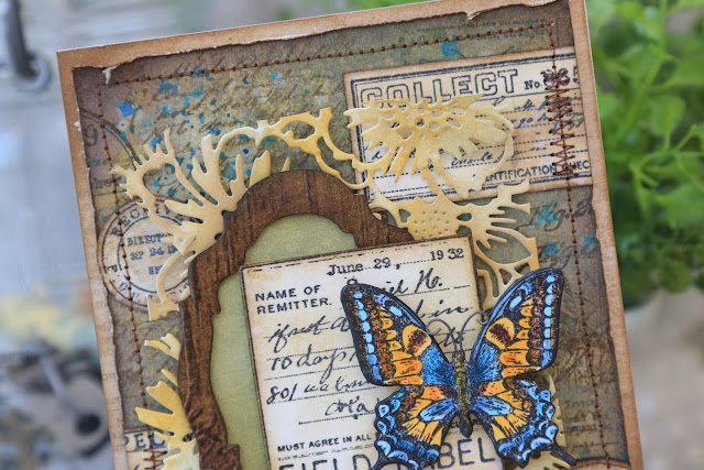
I began by creating the background which is watercolor paper sprayed with Old Paper, Antique Linen and Bundles Sage Distress Stain. Once dry, I then spritzed it with Peeled Paint, Antique Linen and Frayed Burlap Distress Oxide Sprays.  I then spritzed it with water to activate the oxides and dried it again. Finally I splattered some Faded Jeans Distress Spray and Mermaid Lagoon Distress Oxide Spray for a splash of color.  I also stamped the background with various stamps from the Field Notes Stamp Set and a script stamp using Ground Espresso Archival ink.

Field Notes Butterfly Card by Juliana MIchaels featuring Tim Holtz Stamper's Anonymous Field Notes Stamp Set

To create the labels, I stamped several images from the Field Notes set onto watercolor paper using Black Soot Archival Ink. I then fussy cut them into labels. I gave the paper a distressed old paper look by inking the edges with Distress Ink in Vintage Photo and Ground Espresso. I then inked the paper with some Old Paper Distress Oxide and spritzed it with water to activate the oxide and then dried it with my heat tool.

Field Notes Butterfly Card by Juliana MIchaels featuring Tim Holtz Stamper's Anonymous Field Notes Stamp Set

The frame piece was created by die cutting a piece of watercolor paper using the Stacked Baroque Die. To give it the wood grain look, I spritzed the paper with water and embossed it using the 3D Lumber Embossing Folder. I then inked the paper with Vintage Photo, Walnut Stain and Black Soot Distress Ink. To complete the frame I added a piece of green patterned paper to the backside.

Field Notes Butterfly Card by Juliana MIchaels featuring Tim Holtz Stamper's Anonymous Field Notes Stamp Set

You might notice a bit of lacy die cutting in the background. That is the beautiful new Bouquet Thinlits Die. I cut it from Bristol paper and inked with with Fossilized Amber Distress Ink.

Field Notes Butterfly Card by Juliana MIchaels featuring Tim Holtz Stamper's Anonymous Field Notes Stamp Set

The butterfly is from the Flutter Stamp Set. I stamped it onto watercolor paper using Black Soot Archival Ink and then colored it with Distress Ink. I stamped the following inks onto my craft mat and used a water brush to lift the ink and color it onto the stamped image: Salty Ocean, Faded Jeans, Spiced Marmalade and Fossilized Amber.

To finish off the card, I adhered all of the layers and then add a bit of machine stitching with brown thread to the edges.

Field Notes Butterfly Card by Juliana MIchaels featuring Tim Holtz Stamper's Anonymous Field Notes Stamp Set

I hope you enjoyed see how this Field Notes card came together. And here's to hoping that Spring will arrive soon! Thanks so much for your visit and if you have any questions, please don't hesitate to ask in the comments below.

SUPPLIES

This post contains affiliate links to Scrapbook.com and Simon Says Stamp. If you buy anything through my links, it adds no extra cost to you. I truly appreciate and thank you for your support! (If you're interested, you can see my full disclosure statement here.)


Subscribe