INSPIRED BY | Triadic Color Scheme
First off, every piece of paper in this collection has one side that is black and white. This is one of my favorite things about this collection, because it makes these papers perfect for adding your own touch of color to go with your photos or project! When I created my layout for the BoBunny blog using the Zip-A-Dee-Doodle collection I did just that and added my own touches of color. I was inspired to use a what you could call a Triadic Color Scheme because of the red in my Mom's shirt and the blue/green color in the patterned paper. I then selected yellow as my accent color to help tie the red and blue/green together.
If you are interested in learning more about color theory, here are a couple of links:
Color Theory Tips for Web Design
Basic Color Theory
TIP | How to Work with Busy Patterned Paper
Many of you will look at this collection and immediately see how busy the patterns are on all of the papers and it might intimidate you at first. I want to give you some tips that may help you look at this collection in an entirely new light.
To start with, I began by looking through my photos. I knew from how "busy" the papers are that I would need some "bold" photos to stand out against the papers. I chose 3 photos of my Mom wearing a red shirt. The red seemed to stand out against the blue/green colors in some of the patterned papers.
I then laid out all the papers to take a good look at the patterns, specifically their color and the scale of the pattern on each paper. I choose to use only one piece of the colored patterns (green) and then one of the black and white patterns as my background. Can you see how selectively using only 1-2 papers narrows the scope and makes them easier to work with? You really don't need to use all of the patterns on one layout!
TECHNIQUE | Dylusions Spray Ink and Markers
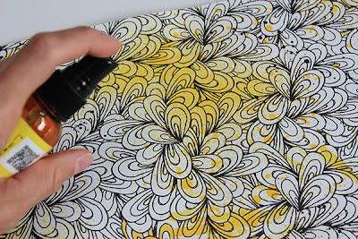
A simple way to add color to the Zip-A-Dee-Doodle papers is using a spray ink or markers. As I mentioned above, I choose to use yellow to compliment the red and blue/green colors I had already selected in my photos and papers. On the black and white pattern that I chose for my background, I added color to it my lightly spritzing it with Dylusions Spray Ink in Lemon Zest.
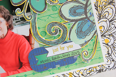
To add the color around my fussy cut flowers, I placed a scrap of paper under the edge of the flowers that I had already attached to my layout. I then colored along the edges with a yellow thick tip marker. The scrap paper allowed me to color without worrying about getting the color on my layout since I had already attached the flowers to it.
Here you can see the two techniques together on the layout.
SUPPLIES | BoBunny
Patterned Paper: Zip-A-Dee-Doodle, Creative and Meow/Zip-A-Dee-Doodle
Combo Stickers: Zip-A-Dee-Doodle
Layered Chipboard: Zip-A-Dee-Doodle
Noteworthy: Zip-A-Dee-Doodle
Other Supplies:
Dylusions Spray Ink in Lemon Zest
Marker: EK Success
Thanks for stopping by today! I hope you enjoyed the tips and techniques that I shared with you and maybe you will find that working with busy patterned papers is more fun than you imagined!


Wow, what a fun layout!
ReplyDeleteWow Juliana this looks fabulous! <3!
ReplyDeleteThis looks fabulous Julianna.. I LOVE the touch of yellow as it really just makes the layout pop :)
ReplyDeleteThis layout is amazing! Love how all those "busy" papers and embellishments works so perfectly together! Love the misting of the background paper! tfs the color theory sites!
ReplyDeletesuper layout!
ReplyDeleteSuch a fun page, Juliana!! Love the mist on the floral paper and all of the pretty fussy cut flowers!
ReplyDeleteLoveeeeeeeeee this!! LOVING the colors (especially the added yellow!!!) and loving the fussy cutting!!
ReplyDeleteSuper page Juliana...love how you put these papers together and the techniques you used! The vibrant photo's definitely stand out against these patterned papers! This collection is a really fun collection and you brought this out in your page! Gorgeous!
ReplyDelete