My Minds Eye July Sketch Challenge | Creative Delight

I love sketches! I love to make sketches! I love to use sketches! Even though I make my own sketches and use them most of the time, it is fun for me to mix it up and use sketches created by other designers. That is exactly what I did for the layout I am sharing with you today.

Creative Delight Layout by Juliana Michaels using the My Mind's Eye July Sketch


I used the My Mind's Eye July Sketch created by Ronda Palazari. I found this sketch to be a little bit of a challenge for me because of the placement of the photos, but I think the end result came together fairly well.

My Mind's Eye July Sketch

TRENDS | Layering and Muted Colors
I love the look of little bits and pieces layered and tucked in here and there on layouts and I gave that I try on my layout. I used a lot of stickers, but I also fussy cut the little tickets from the patterned paper to use as well.  I also really like the muted, softer, color palette especially when my photos are dark. It provides a wonderful contrast and helps the photos stand out a bit more.

Creative Delight Layout by Juliana Michaels using the My Mind's Eye July Sketch

Creative Delight Layout by Juliana Michaels using the My Mind's Eye July Sketch

Creative Delight Layout by Juliana Michaels using the My Mind's Eye July Sketch

TECHNIQUE | Line Drawing and Stickers
I almost always do my journaling by hand. I actually like my own handwriting and it is just so much faster than messing with the printer. If I don't have a lined journaling card to work with, I add my own lines using a metal edged ruler and pen or marker. I usually do my writing first and then I go back and add the lines underneath the words.
Another fun technique I used was to placed the chevron stickers along one edge of my layout to that they were hanging over the edge of the background paper. I then trimmed off the excess and used them on the other side of my layout. 

Creative Delight Layout by Juliana Michaels using the My Mind's Eye July Sketch

SUPPLIES | Listed
Patterned Paper: My Mind's Eye - Find Your Wings & Fly
Stickers: My Mind's Eye - Find Your Wings & Fly, Heidi Swapp
Letter Stickers: My Mind's Eye - Find Your Wings & Fly, Jillibean Soup
Enamel Dots: My Mind's Eye - Find Your Wings & Fly

I hope you enjoyed my take on the My Mind's Eye Sketch! Did you play along this month?

CHA Halloween & Christmas Favorites

I told you I would share my favorite Halloween and Christmas collections and here they are! I love both of these holidays and they are a huge weakness for me when it comes to scrapbook shopping!!!


Well, what do you think? Did I miss any of your favorites! There really were so many great ones out there, it was hard for me to narrow it down!

Paper Bakery Sketch Challenge #9

Are you ready for another Paper Bakery Sketch Challenge? I sure hope so, because this one is full of fun layers and ideas of using multiple photos! You are sure to find it inspiring. I know I did!


Paper Bakery Sketch Challenge 9 Juliana Michaels

For my take on the sketch I flipped the design horizontally and I used two photos instead of three. The one thing I loved about this sketch were all the fun layers and banner strips so I did my best to incorporate as many of them as possible into my design. I created my layout using a mix of the July Boardwalk Scrapbook Kit and Project Kit! Seriously they are perfect together because everything coordinates fabulously! I also had fun using the exclusive Paper Bakery Chain Link Stencil that is part of the July Mixed Media Kit.

Paper Bakery July Boardwalk Kit Juliana Michaels North Layout

I placed the stencil on my layout and then applied a thin layer of Liquitex Modeling Paste using a putty knife. Remember to give it time to dry before you add the rest of your papers and embellishments.

Paper Bakery July Boardwalk Kit Juliana Michaels North Layout

Some favorites of mine from the  Scrapbook Kit were the exclusive Paper Bakery Compass Flair and the cute little anchor charms! I thought they were totally adorable and they fit perfectly with the theme of my layout.

Paper Bakery July Boardwalk Kit Juliana Michaels North Layout

Paper Bakery July Boardwalk Kit Juliana Michaels North Layout

Here are the details you need to know to play along with us using the sketch:

1.) We will have a new Sketch Challenges every two weeks. Play along for your chance to win a $10 coupon to the Paper Bakery store.
2.) Make a layout or project utilizing the sketch. Be creative and have fun! We would love to see what you create using a Paper Bakery kit however, using a kit is not required for you to play along.
3.) Take a picture and link it up on the sidebar of the Paper Bakery blog using the INLINKZ widget by the due date August 10.
4.) Winners will be randomly selected and we will post them on the Paper Bakery Facebook page and on the Paper Bakery blog.  Make sure to follow us on both to find out if you are the winner!!!

I hope you enjoy the new sketch and I can't wait to see how it inspires you! Also, if you have any suggestions about things you would like to see in future sketches, just let me know!

Summer 2013 CHA Favorites | Collections

So who has enjoyed seeing all the new collections released from all the scrapbook manufacturers these past few weeks? I know I have. Since the first peaks were being shared, I have been "collecting" my favorites on Pinterest. Today however, I thought I would share some of my favorites here on my blog. One thing I found very interesting in my choices was that nearly every collection is a combination of the Pantone Spring 2013 Color Report


Another thing I noticed is that all of them have gorgeous tints and shades of blue. Lately, I have been loving blue and it really shows in my choice below!


These are the collections that I fell in love with! I also have some embellishments within these collections and other collections that really caught my eye as well. Next week, I am going to share a post about my favorite Halloween and Christmas releases, so stop back by then if you are interested!

So, what are your favorites? Anything different from my list? I would love to hear what you are loving this season!

Bo Bunny Noteworthy | Home Sweet Home

There is nothing quite like feeling at home and our new home as become just that....Home. Home sweet home in fact! We both really love so much about it and feel truly blessed to live in such a wonderful house. It has been a stark contrast living in this newly built home compared to our last home that was built in 1896! But we have adjusted quickly!!! For this layout I wanted to share a couple photos of our new home shortly after we had moved in so that I could remember how happy it made me feel to be living in it. The Bo Bunny Family Is collection seemed like the perfect range to work with because of some of the embellishment containing the words "home".

Home Sweet Home Layout by Juliana Michaels using Bo Bunny Family Is

Bo Bunny's Family Is collection has nearly every color from the Pantone Spring 2013 Color Report except the purple color. I love the contrast of the slightly muted tones against the pop of the darker ones. It's also very exciting to see our beloved scrapbook products so on trend!!! 

Pantone Spring 2013 Color Report

INSPIRED BY | Bo Bunny Noteworthy Envelope
As I pulled all of the pieces out of the Noteworthy package, I saw this little envelope and assembled it (pictured in the detail shot below). Next I saw the little hearts and the word piece "you & me" and the envelope seemed like the perfect home. I then started layering more Noteworthy pieces on my background paper with my photos. It wasn't totally planned, but as I started playing with the bits and pieces of Noteworthy it just happened and I realized that the design style reminded me very much of the super talented Lisa Rubin Swift. I adore her fun style and I feel like this layout has captured a bit of her style.

Home Sweet Home Layout by Juliana Michaels using Bo Bunny Family Is

TIP |  Sticker Fix
When I am creating, I have to be able to see what I am making. I can't totally visualize it in my head. As I am creating a layout, I love to move things around to see how they are going to look before I adhere them. This is great with paper, but can be a bit of a challenge with stickers. My solution, I attach them to scrap paper or chipboard and trim around them. Then they are easy to move around until I have found their final resting place on my layout. 

Home Sweet Home Layout by Juliana Michaels using Bo Bunny Family Is

Home Sweet Home Layout by Juliana Michaels using Bo Bunny Family Is

There are so many bits and pieces on this layout that have a significant meaning to me. Do you see any? Do you ever create layouts where you use some of the embellishments to capture your story beside just putting it into words? 
Thanks for stopping by today and I hope you come back again soon!

Staple It Together | A Tutorial with Crate Paper Plastic Alphas

Hello and welcome everyone! Have you seen Paper Bakery's July Boardwalk kits? I have had so much fun creating with them! The nautical theme of this month's kit was perfect for our recent move to live near Lake Erie and I used it to scrap a photo of me during one our first trips to the beach. It was still a little cold out that day, which is why I have on my winter coat! Scrapping this photo really shows the versatility of this kit.

Paper Bakery July Boardwalk Kit Lake Erie Layout by Juliana Michaels

I used my Nautical By Nature digital cutting file to create a fun journaling spot for my layout. You can download this free digital cutting file on my blog or from Paper Bakery's blog.  I also used some cuts from Paper Bakery's July cut file as well! In this detail shot you can see a peek of the Crate Paper Clear Alphas that I used for my title. Keep reading for a fun little tutorial that I created to share with you on how I attached these letters to my layout using a stapler!

Paper Bakery July Boardwalk Kit Lake Erie Layout by Juliana Michaels

This little cluster of goodness was fun to create using a mix of the Studio Calico Atlantic Brads, Wood Veneer and Vellum Die Cuts.

Paper Bakery July Boardwalk Kit Lake Erie Layout by Juliana Michaels

TRENDS | Nautical and Wood
Nautical, nautical, nautical! Need I say more! The nautical look is everywhere right now and I am loving it! Especially the combination of orange and navy in Studio Calico's Atlantic collection. I have always loved orange and now I am loving navy too!  
Another big trend is wood, and Studio Calico has been doing it well with all of their fabulous wood veneers sets. The fun stained pieces that are part of the Atlantic collection provide a darker alternative to the sets they have been releasing and I find the darker color a fresh new option.


TUTORIAL | Stapler + Crate Paper Clear Alphas
I want to share with you a technique that I came up with using a stapler and the Crate Paper Clear Alphas. This technique came from the fact that I did not have a stapler strong enough to go through the two layers of plastic and I wanted to staple them together! If you have a more industrial type stapler you should be able to staple through these letters with no problem.

1. Begin by selecting the letters you want to use. The letters have a plastic covering on the front side that you will want to remove before adding them to your layout.  Place the letters so that they slightly overlap each other.

Paper Bakery July Boardwalk Crate Paper Clear Alphas Tutorial by Juliana Michaels

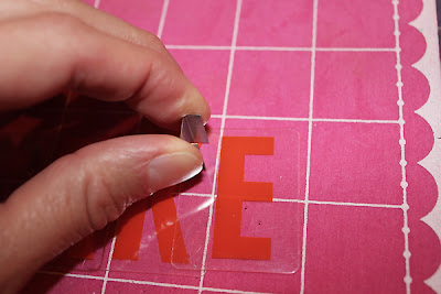
2.  Remove some staples from your stapler and hold them on the letter like this.

Paper Bakery July Boardwalk Crate Paper Clear Alphas Tutorial by Juliana Michaels

3. Use a craft pick and poke holes in the plastic letters using the stapler as a guide for where to poke the holes.

Paper Bakery July Boardwalk Crate Paper Clear Alphas Tutorial by Juliana Michaels

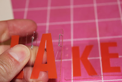
4.  Take one of the staples and put it through the poked holes. Add the next letter and fold the staple together to hold the letters together.  Repeat this on each letter.

Paper Bakery July Boardwalk Crate Paper Clear Alphas Tutorial by Juliana Michaels

You can also poke holes through your layout to use this same technique to attach the letters to your layout.

Paper Bakery July Boardwalk Crate Paper Clear Alphas Tutorial by Juliana Michaels

I hope you enjoyed this tutorial today and thanks so much for stopping by!
Subscribe